Making Drawings Move
To set drawings in children’s programs in motion, tv-illustrators had several tricks up their sleeves.
Dutch children’s television doesn’t have a very long animation history. Instead, children’s programs were often illustrated with very artistic non-moving drawings, as my previous blog post has shown. But at a certain point, illustrators felt that the property of movement, that is inherent to television, required moving imagery. Since television budgets and deadlines did not allow expensive and time-consuming cell animation or stop motion at first, the illustrators got creative.
Pulling on pieces of paper
The Dutch Institute for Sound and Vision in Hilversum holds a collection of drawings made by Jos van Grieken, who worked for the facility company NTS between 1955 and 1980. There is a very interesting transition from black and white to colour television noticeable in this collection. Moreover, his early black and white work, which must have been made before 1969, often has little slides, movable parts and intricate contraptions with wire or split pens to make parts of the illustrations move. His drawings do not give much information though, so unfortunately it’s a challenge to find out for which programs they were made.
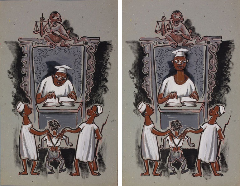
Program unknown, illustration by Jos van Grieken, photographed at the archives of the Dutch Institute for Sound and Vision
Jos van Grieken wasn’t the only one to do this: others, such as freelance illustrator Noni Lichtveld, also made illustrations with parts that moved when a little slide outside the screen was pulled. In die dagen (In those days, CVK/IKOR/RKK, 1967), a catholic program of several short episodes about the life of prophet Isajah, is an impressively detailed example. Since these programs are shot in live-action and not in stop motion, they resemble books with slides more than animations, and can definitely be seen as the first attempts to make illustrations move.
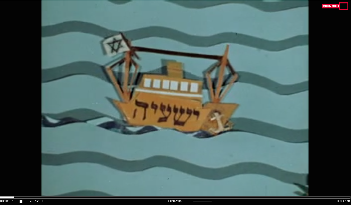

In die dagen, CVK/IKOR/RKK, 1967, Screenshots taken from the digitalised program at the Dutch Institute for Sound and Vision
3D illustration
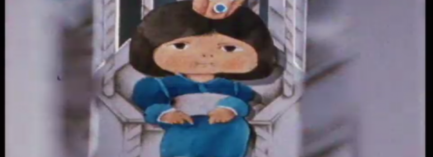
Some illustrators tried to get around the static characteristic of illustration in another way: by making 3D-illustration. Henk Vermolen in particular was skilled at building models of cities and cutting out characters to place them in the miniature sets he made. One example is Kleine Isar (Little Isar, NCRV, 1981). Although this program is from the eighties, there are earlier examples of 3D-illustration as well. Kleine Isar is a beautiful 18-episode series about a little king who tries to find Jesus and has all kinds of adventures on his journey. Although the sets and characters are completely static, the scenes look quite dynamic because the camera moves through the sets with panning, tilting and zooming motions. Furthermore, the added third dimension gives the program depth, which is hard to achieve with two-dimensional drawings.
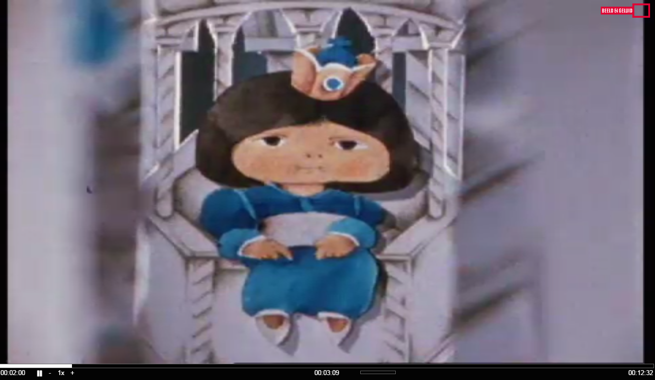
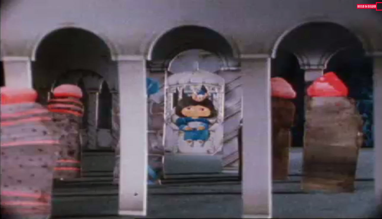
Kleine Isar, NCRV, 1981, Screenshots taken from the digitalised program at the Dutch Institute for Sound and Vision
Simple animation
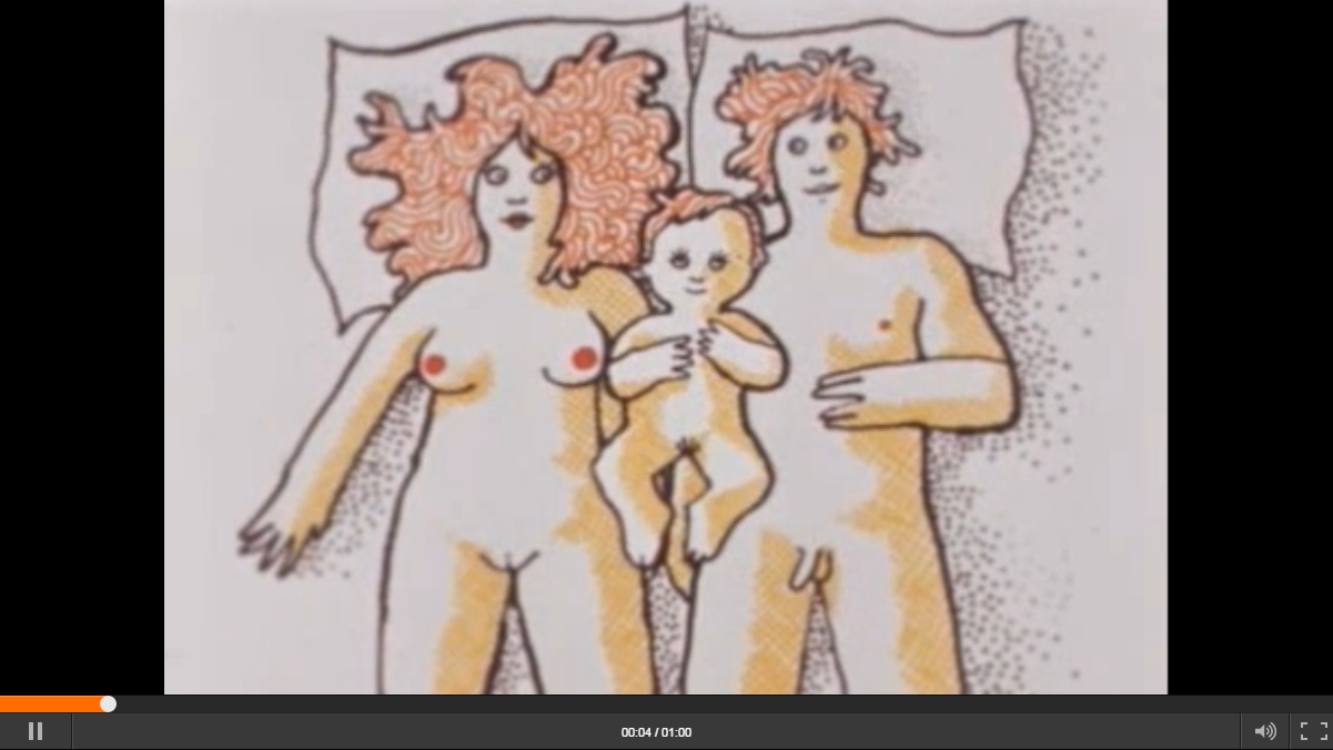
In the seventies, the group of tv-illustrators who worked for the NOS (previously NTS) roughly split in two: although all of them kept illustrating most programs, some preferred making traditional illustrations while others enjoyed experimenting with animation whenever they got the chance. At that point, several factors made certain steps towards animation possible: there was more money to buy new cameras for stop-motion, and the heads of the Design Department of the NOS gave illustrators a lot of freedom to use their imagination and to experiment and find new ways to visualise their assignments. Most animations in the seventies were made on cell, with an illustration as the basis, layered with transparent sheets called ‘cells’ on which the movable parts were drawn. These cells were continuously replaced under the camera to create a stop-motion. An item from Open en Bloot (Open and Exposed, VARA, 1974), animated by Hans de Cocq, shows the result of this technique, as you can see here. Most parts of the animation stay the same while some elements move, so it is easy to spot the parts that were drawn on paper, and the parts that were drawn on cell.
It was now a small step to full animation. One of the illustrators who liked making animations was Arie Teunissen. He made many animated items for various programs, among which De Film van Ome Willem (The Movie of Uncle Willem, VARA, 1972-1990).
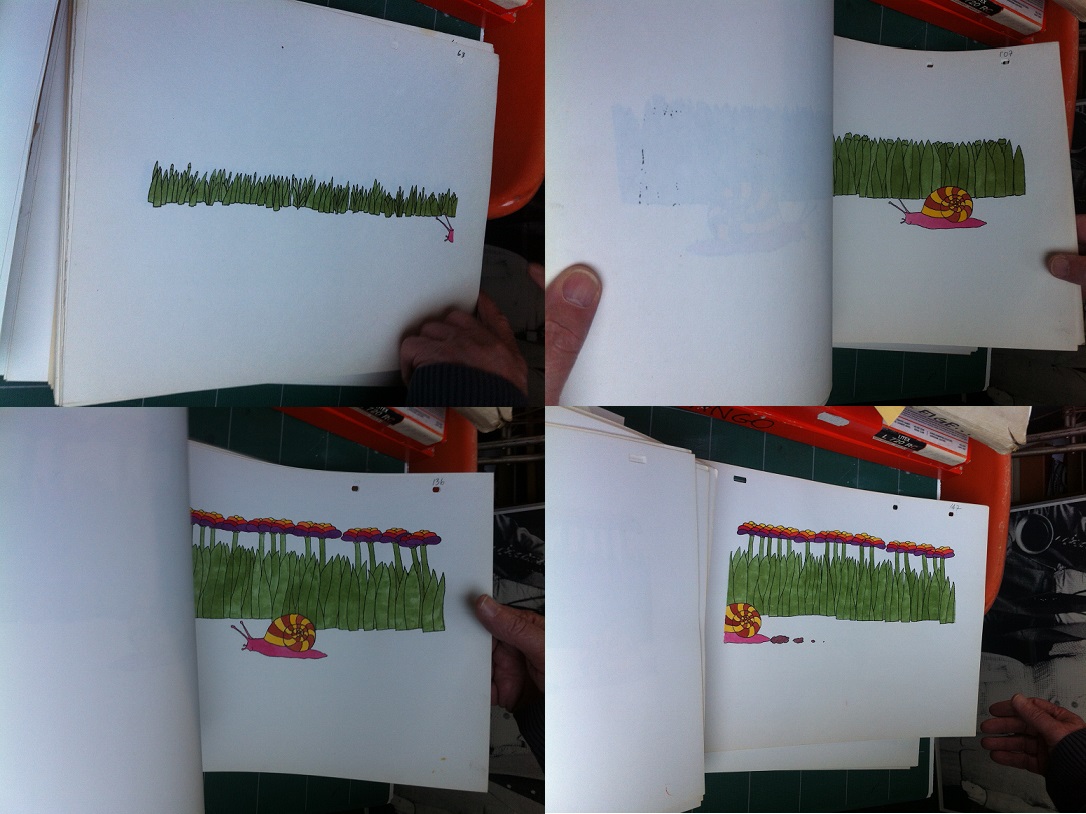
De film van Ome Willem, Langzaam en snel, VARA, around 1978, Photographed at the studio of illustrator Arie Teunissen
Animation usually consists of 24 frames per second, but the illustrators of the NOS Design Department used 12 frames per second to save time. This way, the movements are still sufficiently fluent. In the animation above, in which a snail travels so slow the flowers start to bloom, you see that the snail moves through the screen in 84 frames (the drawings are numbered in the upper right corner), which is 7 seconds of animation. The endless creativity and artistic quality that illustrators like Arie Teunissen brought, resulted in artistic and high quality television that was praised on international exhibitions. Critics even called the Dutch animations and graphics the best in the world, together with the graphics of the BBC.
The lack of time and money is also the reason that mostly small items within bigger programs were animated. There is only one Dutch production known with fully traditionally animated episodes, and that’s Alfred Jodocus Kwak (VARA, 1989-1991). True, the animation is done in Japan and not by the NOB (as the NOS now was called since it had privatised in 1989), but besides that it is a completely Dutch production with 52 episodes of 20 minutes, which is impressive considering the history of decades of creatively making use of the small budgets and available resources.
The privatization of the NOB happened around the same time Alfred J. Kwak came out, and it changed the history of Dutch tv-illustration. The NOB, which was used to being the only facility company for television, now had to compete with other companies. But there was another influence that really sparked new creativity and opened up many possibilities, and that is the introduction of the computer. More on computer animation in my next blog post.
© Grietje Hoogland and Leiden Arts in Society Blog, 2016. Unauthorised use and/or duplication of this material without express and written permission from this site’s author and/or owner is strictly prohibited. Excerpts and links may be used, provided that full and clear credit is given to Grietje Hoogland and Leiden Arts in Society Blog with appropriate and specific direction to the original content.


0 Comments